
Finance analytics guide
Financial dashboards in Power BI
Build reporting that connects financial performance to the decisions behind it—using trusted definitions, a robust model, and a layout leaders can read quickly.
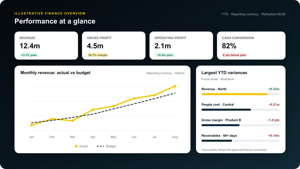
A useful Power BI financial dashboard does more than display revenue, cost, and profit. It gives finance leaders a controlled view of actuals, budget, forecast, cash, and operational drivers—then makes it easy to move from a variance to its cause.
Key takeaways
1Definitions come first
Agree sign conventions, scenarios, fiscal periods, currency treatment, and KPI ownership before writing DAX.
2Model for explanation
Use dimensions such as account, date, entity, cost centre, scenario, and currency around transaction facts.
3Design for decisions
Lead with exceptions and material variances, then provide a clear route to drivers and transaction detail.
What should a finance dashboard do?
A financial dashboard is an interactive management view of financial performance. It should help a reader assess the current position, compare it with a target or prior period, understand the drivers of change, and identify an action or follow-up question.
That makes a dashboard different from a statutory financial statement. A profit and loss statement is structured to report recognised financial results. A management dashboard combines that controlled financial view with comparisons, trends, business dimensions, and operational drivers. The two should reconcile, but they serve different reading behaviours.
Begin with decisions, not visuals
Before opening Power BI, write down the recurring decisions the report should improve. Examples include where to reduce discretionary spend, which product or region explains a margin movement, whether cash conversion is weakening, or whether a forecast remains credible.
Each dashboard page should have a defined job. If a visual does not help the reader assess a position, explain a movement, or decide what to do next, it probably does not belong.
Choose decision-ready financial KPIs
The right KPI set depends on the organisation, its accounting policies, and the decisions being made. The list below is a design starting point, not a universal chart of accounts.
| Decision area | Useful measures | Comparison | Likely drill path |
|---|---|---|---|
| Growth | Revenue, recurring revenue where applicable, volume, price or mix | Budget, forecast, prior period | Entity -> region -> product or customer |
| Profitability | Gross profit, operating profit, EBITDA where formally defined, margin percentages | Plan and prior year | Account group -> cost centre -> transaction |
| Cost control | Operating expense, personnel cost, discretionary spend, unit cost | Budget and run rate | Function -> owner -> supplier |
| Cash and working capital | Cash balance, operating cash flow, receivable and payable ageing, inventory days where relevant | Forecast and policy threshold | Entity -> counterparty -> ageing band |
| Planning | Actual, budget, forecast, variance, forecast accuracy | Latest approved scenario | Version -> period -> account |
Write a KPI definition sheet
For every headline measure, document its business definition, source, grain, owner, sign convention, treatment of eliminations, currency basis, and refresh timing. Also define whether an unfavourable variance is shown as a negative number, a positive cost overrun, or a separate status. Consistency matters more than cosmetic convention.
Ratios need equal care. For example, a gross margin percentage should normally be calculated from aggregated gross profit and revenue, not averaged from row-level percentages.
Build a reliable Power BI finance model
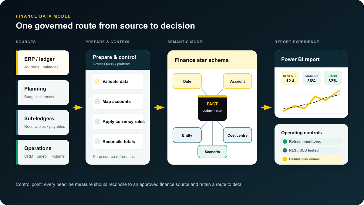
A strong dashboard usually sits on a dimensional model. Microsoft’s Power BI guidance describes a star schema as a mature modelling approach in which dimension tables support filtering and grouping while fact tables store events and measures. For finance, this creates a clearer route from a consolidated number to the transactions behind it.
Use dimensions that match finance questions
A typical model may include dimensions for date, account, entity, cost centre, department, product, customer, supplier, scenario, and currency. Fact tables might store general-ledger postings, budgets, forecasts, invoices, payments, or operational quantities.
Keep the grain explicit. A general-ledger fact might represent one posted journal line in one entity, currency, and accounting period. A budget fact might represent one account–cost-centre–month combination. Do not merge facts at different grains into one table simply because the columns look similar.
Design the account hierarchy deliberately
Source account codes rarely produce a useful management statement on their own. Maintain a governed mapping from account to reporting line, subtotal group, sign treatment, and display order. If multiple reporting structures are needed, model those mappings transparently rather than hiding logic across many measures.
Use a controlled date dimension
Finance reporting often needs fiscal year, fiscal period, month-end, quarter, working day, and period-status attributes. Power BI supports a designated date table, which gives the model control over date hierarchies and time-intelligence behaviour. Confirm how 4-4-5 calendars, adjustment periods, and year-end postings should be represented.
Separate scenarios and currencies
Actual, budget, and forecast data should share conforming dimensions but retain a visible scenario and version. Currency reporting should distinguish transaction, local, and reporting currency. Store the exchange-rate method and effective date required by finance policy; do not treat conversion as a formatting choice.
Plan a dashboard that moves from signal to detail
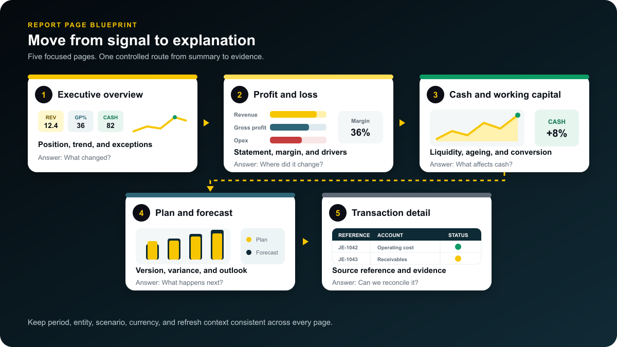
Power BI reports can contain multiple interactive pages, drill-through paths, and cross-filtering. Use that flexibility to create a deliberate reading sequence instead of compressing every finance question onto one canvas.
1. Executive overview
Show a restrained set of headline measures, period and entity context, material variances, a trend, and a short list of exceptions. A leader should understand the position before interacting with a slicer.
2. Profit and loss
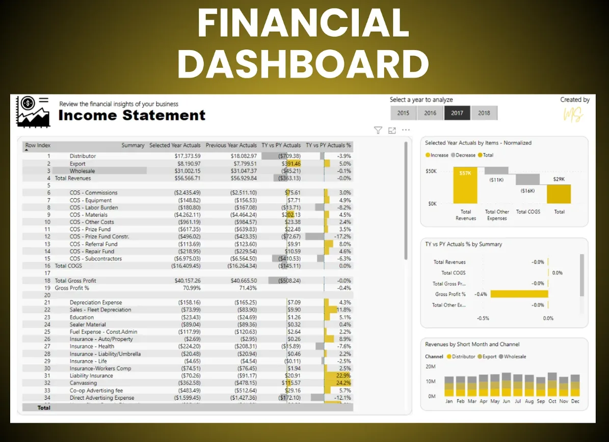
Use a matrix for the recognised statement structure, supported by variance columns and one or two explanatory visuals. Allow drill-through from reporting line to entity, cost centre, and account.
3. Cash and working capital
Separate cash movement from profit. Surface liquidity, forecast movement, overdue receivables, payment timing, and the business drivers relevant to the organisation.
4. Budget and forecast
Compare actuals with the latest approved plan, show remaining-period expectations, and keep version labels visible. Users should never have to guess which forecast they are viewing.
5. Detail and reconciliation
Provide a controlled detail page for validation. Include identifiers, posting dates, source references, and export rules appropriate to the user’s permissions. This page builds trust but should not become the landing page.
How to build the dashboard step by step
- Define the audience and decisions. Interview the people who will use the report and record the questions they ask in reviews.
- Agree the KPI contract. Obtain finance approval for definitions, signs, scenarios, currency rules, materiality thresholds, and ownership.
- Profile the sources. Assess ERP, planning, payroll, CRM, banking, and spreadsheet data for keys, granularity, completeness, and history.
- Prepare and reconcile the data. Standardise types, map accounts, preserve source identifiers, and reconcile totals to controlled finance outputs before visual design.
- Build the semantic model. Create fact and dimension tables, one-to-many relationships, a date dimension, and reusable measures.
- Prototype one page. Validate the executive overview with users before building the rest of the report.
- Add guided analysis. Configure drill-through, tooltips, navigation, and filters only where they help answer a known question.
- Test security and refresh. Test roles, failure states, refresh history, gateway behaviour where required, and the experience after publication.
- Run user acceptance testing. Reconcile selected periods and entities, test edge cases, and capture approval from measure owners.
- Document and monitor. Publish definitions, ownership, refresh timing, known limitations, and a change process.
DAX pattern examples
The exact field names and sign logic must follow the approved model. These simplified measures show the pattern only:
Total amount :=
SUM ( 'Finance Fact'[Reporting Amount] )

Actual amount :=
CALCULATE ( [Total amount], 'Scenario'[Scenario] = "Actual" )

Budget amount :=
CALCULATE ( [Total amount], 'Scenario'[Scenario] = "Budget" )

Variance to budget :=
[Actual amount] - [Budget amount]

Variance to budget % :=
DIVIDE ( [Variance to budget], [Budget amount] )
In a production model, consider how zero budgets, expense signs, currency, calculation groups, and row-level context affect these measures. A technically valid formula can still be financially misleading.
Design for fast comprehension
- Make context persistent. Display the reporting period, entity, scenario, currency, and last refresh time where users can see them.
- Use colour sparingly. Reserve emphasis for material exceptions or the most important series; add text, icons, or markers so colour is not the only signal.
- Use descriptive titles. “Operating expenses above budget by department” is more useful than “Expense chart”.
- Show units clearly. Label currency, thousands or millions, percentages, and whether amounts are monthly, year-to-date, or rolling.
- Keep visual density controlled. Fewer, well-labelled visuals usually improve both comprehension and report performance.
- Make accessibility part of design. Microsoft recommends meaningful titles, alt text, logical tab order, sufficient contrast, and report testing with accessibility features.
Avoid relying on tooltips for essential conclusions. Important context should be visible without mouse interaction. Keep slicers consistent across pages, and test the report at the screen sizes used in finance meetings.
Governance, refresh, and security
Treat reconciliation as a product feature
For every release, compare the semantic model with controlled source totals across representative periods, entities, scenarios, and currencies. Record expected differences, such as late journals or consolidation eliminations, rather than letting unexplained gaps become normal.
Match refresh to the decision
Daily refresh may suit closed-period management reporting, while cash or operational finance views may need a different cadence. Power BI supports scheduled and on-demand semantic-model refresh. Incremental refresh can reduce the data processed for large, frequently changing fact tables when the source supports the required date filtering and query behaviour.
Apply security at the right level
Use workspace permissions, app audiences, and semantic-model security as a coordinated design. Row-level security can restrict which rows a viewer sees, while object-level security can restrict model tables or columns. Test the effective experience for each audience; finance data should not rely on hidden report pages as a security control.
Define ownership
Assign owners for source feeds, account mappings, KPI definitions, access approvals, refresh failures, and report changes. A dashboard without operating ownership will drift even if the original build was sound.
Common mistakes and how to avoid them
| Mistake | Why it causes problems | Better approach |
|---|---|---|
| Designing from an existing spreadsheet layout | It preserves manual constraints and often hides the real decision flow. | Start with questions, then decide which statement structures must be retained. |
| Building KPIs before agreeing definitions | Different teams interpret the same label differently. | Approve a KPI definition sheet with finance owners. |
| Mixing grains or using uncontrolled many-to-many joins | Totals can duplicate or change unpredictably during filtering. | Declare each fact grain and use conformed dimensions or explicit bridges. |
| Showing only actual values | A number without a benchmark gives little decision context. | Provide budget, forecast, prior period, or a policy threshold. |
| Using red and green as the only status signal | It reduces accessibility and can oversimplify favourable versus unfavourable movements. | Add variance labels, icons, and explanatory text. |
| Publishing without reconciliation or role testing | Users may see incorrect totals or unauthorised data. | Use a release checklist with numerical and access test cases. |
Frequently asked questions
Which financial dashboard should be built first?
Start with the management view used in the most important recurring review. For many organisations, that is an executive actual-versus-plan overview with a route to profit and loss detail. Choose the first page by decision value and data readiness, not by which data is easiest to extract.
Can Power BI replace Excel for finance reporting?
Power BI can centralise repeatable models, calculations, security, distribution, and interactive analysis. Excel remains useful for ad hoc analysis, input workflows, and detailed modelling. A well-designed approach often gives each tool a clear role instead of forcing one to replace the other.
Should financial reporting use Import or DirectQuery?
Import mode often provides responsive analysis when the model can be refreshed within the required window. DirectQuery may suit volumes or freshness requirements that make importing impractical, but report performance depends more directly on the source. Select the mode from scale, latency, governance, and performance requirements; test it with realistic finance queries.
How many visuals should a finance dashboard page contain?
There is no fixed number. Use the minimum needed to communicate the page’s purpose without duplication. If readers cannot identify the main result and exception quickly, reduce the density or split the analysis across pages.
How often should a financial dashboard refresh?
Match refresh to the decision and source close process. A faster schedule does not make incomplete ledger data more reliable. Show the last successful refresh and clarify whether periods are open, preliminary, or closed.
How do you prove the dashboard is accurate?
Reconcile controlled totals, test calculations and filter paths, sample transaction drill-through, validate exchange-rate and scenario logic, and obtain sign-off from measure owners. Repeat these checks after material model or source changes.
Build clarity before complexity
The best financial dashboards make the organisation’s financial logic visible. Their value comes from common definitions, traceable data, and a report structure that leads from result to reason—not from the number of visuals on the page.
Begin with one decision, one trusted model, and one carefully tested page. Once people can reconcile the numbers and use the view in a real finance conversation, expand deliberately.
Continue learning
Sources and further reading: Microsoft guidance on star schema design; Power BI date tables; designing accessible Power BI reports; Power BI data refresh; incremental refresh; and Power BI report-consumer security planning.